Driven to Divide: Insights & Perspectives
Exploring the forces and ideas that shape our divided world.
Color Me Impressed: Choosing the Perfect Palette for Your Website
Discover the secrets to selecting the perfect color palette for your website and boost your online appeal! Transform your site today!
Understanding Color Theory: A Guide to Choosing Your Website Palette
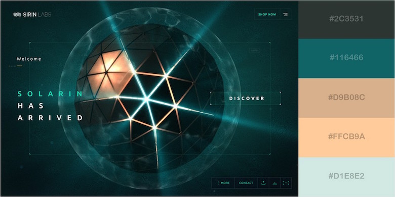
Understanding color theory is essential for creating an effective website palette that resonates with your target audience. Color theory encompasses the principles of how colors interact, evoke emotions, and influence perception. By leveraging these principles, you can choose colors that not only reflect your brand identity but also enhance user experience. For instance, warm colors like red and orange can create a sense of urgency, while cool colors like blue and green convey tranquility and trust. Understanding these associations will help you select a harmonious color scheme that attracts visitors and encourages engagement.
When selecting a color palette for your website, consider using the 60-30-10 rule, a classic approach to color distribution. This method suggests that 60% of your website's primary color should dominate the layout, 30% a secondary color for contrast, and 10% an accent color to draw attention. Additionally, utilizing tools like color wheels or online color palette generators can simplify the process of finding complementary shades. Remember, consistency in your color choices across all pages will strengthen your brand recognition and create a cohesive visual experience for your users.

The Psychology of Color: How to Evoke Emotion with Your Website Colors
The psychology of color plays a crucial role in how visitors perceive your website and interact with your content. Different colors can evoke a multitude of emotions and associations; for instance, blue often conveys trust and calmness, making it a popular choice for corporate websites. On the other hand, red can generate feelings of excitement and urgency, which is why it’s frequently used for calls to action and promotional elements. By understanding the emotional impact of various colors, you can strategically select a palette that aligns with your brand's message and resonates with your target audience.
To effectively utilize color psychology, consider creating a color palette that reflects the core values of your brand. For example, if your brand aims to promote sustainability, you might choose earthy tones like greens and browns to evoke a sense of nature and responsibility. Additionally, it's essential to maintain balance and ensure that your chosen colors complement each other rather than clash. Tools like color wheel charts can assist in discovering harmonious combinations. Ultimately, harnessing the power of color can significantly enhance user experience and lead to a more emotionally connected audience.
Top 5 Mistakes to Avoid When Selecting a Color Palette for Your Website
Choosing the right color palette for your website can significantly impact user experience and brand perception. One common mistake that many designers make is neglecting their target audience. Different demographics respond to colors differently, so it's crucial to consider who will be visiting your site. For example, vibrant and energetic colors may attract a younger audience, while softer, muted tones might resonate better with a more mature demographic. Always conduct research on color psychology to ensure your chosen colors align with your brand's message and audience's preferences.
Another mistake to avoid is overcomplicating your palette. A common rule of thumb is to stick to a limited color scheme that includes one primary color, a secondary color, and one or two accent colors. Too many colors can lead to a chaotic design that confuses visitors and dilutes your brand identity. Consider creating a harmonious palette by choosing colors from the same family or using tools like Adobe Color Wheel to help generate complementary combinations. This not only creates a visually appealing aesthetic but also strengthens your brand recognition.