How Data Visualization Software Turns Complex Data into Actionable Insights
In today's data-driven world, businesses generate enormous amounts of information. It can be overwhelming to sift through complex data sets and extract meaningful insights. This is where data visualization software plays a pivotal role. By transforming difficult-to-understand data into visual formats such as graphs, charts, and dashboards, users can easily comprehend trends and patterns that were previously hidden. As a result, organizations can make more informed decisions, ultimately enhancing their productivity and efficiency.
The true power of data visualization software lies in its ability to convert intricate details into actionable insights. For instance, with tools like Tableau or Microsoft Power BI, users can create customized visualizations that focus on their specific needs. These tools not only allow users to analyze past performance, but also help forecast future trends, enabling proactive decision-making. In an era where data is abundant, leveraging data visualization can be the key differentiator for successful organizations.
The Benefits of Using Data Visualization to Simplify Decision-Making
Data visualization plays a crucial role in simplifying decision-making processes within organizations. By transforming complex data sets into clear, visual representations, stakeholders can easily identify trends, outliers, and patterns that might be overlooked in traditional data reports. Visualization tools such as Tableau and Microsoft Excel allow users to create intuitive charts and graphs that enhance comprehension, leading to faster and more informed decisions. This not only improves efficiency but also fosters a data-driven culture where every team member can contribute insights based on visualized information.
Furthermore, the benefits of data visualization extend beyond immediate decision-making. It helps to communicate analytical findings effectively to various stakeholders, regardless of their technical expertise. For instance, a well-designed dashboard can provide executives with at-a-glance insights that are easy to digest. As noted in Forbes, effective data visualization empowers teams to work collaboratively towards common goals by making relevant information accessible and actionable, ultimately driving better outcomes for the organization.
Top Tools for Transforming Chaos into Clarity: A Guide to Data Visualization Software
In today's data-driven world, organizations often find themselves drowning in a sea of information, making it crucial to utilize data visualization software to embrace clarity amidst chaos. These tools empower users to transform complex datasets into easily digestible formats, enabling better decision-making and communication. Popular tools like Tableau and Microsoft Excel excel at presenting visual representations of information, such as charts, graphs, and dashboards. By leveraging these capabilities, businesses can identify trends, spot anomalies, and convey insights effectively.
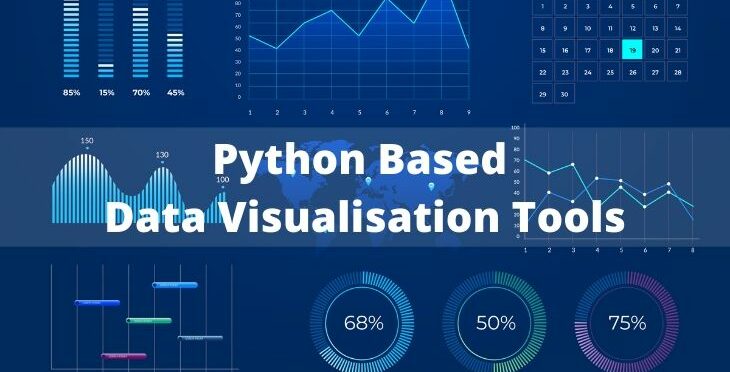
Furthermore, open-source options like R and Python, especially with libraries such as ggplot2 and Matplotlib, offer powerful capabilities for customizing data visualizations at a deeper level. This flexibility allows users to tailor their visuals to suit specific needs, enhancing the overall data storytelling process. As you explore the diverse landscape of data visualization software, consider your organization’s requirements and the types of insights you wish to communicate, ensuring you select the best tool to transform your chaos into clarity.