Understanding Responsive Web Design: Why It Matters for User Retention
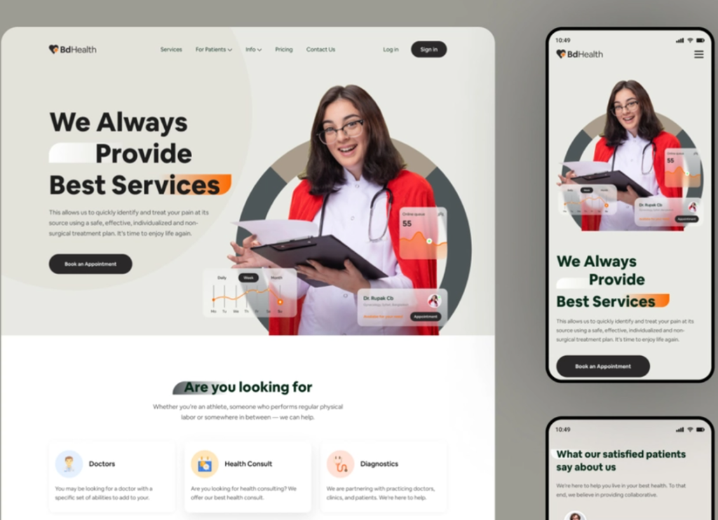
Responsive web design is an approach that ensures your website adapts seamlessly to various screen sizes and devices. In today's digital landscape, where users access content from smartphones, tablets, and desktops, a responsive design is not just a trend but a necessity. A well-implemented responsive design improves user experience by providing an intuitive layout that caters to different viewing environments. This adaptability is crucial for retaining users, as research shows that over 70% of mobile users are more likely to return to a site that is mobile-friendly.
Moreover, responsive web design plays a significant role in enhancing SEO performance. Search engines like Google prioritize websites that offer a user-friendly experience across all devices, which can positively impact your search rankings. When users find what they are looking for quickly and effortlessly, it reduces bounce rates, thereby improving the likelihood of conversions and repeated visits. Therefore, investing in a responsive site design is not only beneficial for immediate user retention but is also a strategic move for long-term digital success.
Common Mistakes in Responsive Web Design and How to Avoid Them
Responsive web design is essential in today's digital landscape, but many developers make common mistakes that can hinder user experience. One major error is neglecting to test the website on various devices. Since users access websites from a multitude of screens—ranging from smartphones to large desktop monitors—it's crucial to ensure that your design adapts appropriately. To avoid this mistake, consider using a variety of emulators and real devices during the testing phase. Additionally, employing tools like media queries will help you tailor content for different screen sizes, ensuring an optimal experience for all users.
Another typical pitfall is failing to prioritize load times for responsive sites. Often, developers include unnecessary elements that can significantly slow down the page. This not only impacts user experience but also affects your site's SEO rankings. To avoid this mistake, conduct regular performance audits and eliminate any non-essential components. Optimize images, leverage browser caching, and minimize CSS and JavaScript files. By focusing on speed, you’ll enhance user engagement and make your website more attractive to search engines.
How to Test Your Website's Responsiveness for Maximum User Engagement
In today's digital landscape, ensuring your website's responsiveness is crucial for maximizing user engagement. A responsive website adapts seamlessly to different screen sizes and devices, providing a consistent experience for all users. To test your website's responsiveness, start by utilizing responsive design testing tools such as Google's Mobile-Friendly Test or BrowserStack. These tools allow you to view how your website performs on various devices, including smartphones, tablets, and desktops. Make a list of the devices you want to test and examine each layout, noting any design or usability issues that may arise.
Another effective method for assessing your site's responsiveness is to manually check its performance by resizing your browser window. As you adjust the size, observe how elements like images, text, and navigation menus transition. A well-optimized site should maintain usability and aesthetic appeal across all screen sizes. Additionally, consider conducting user testing with different demographics to gather feedback on their experience. This qualitative data will help you identify weaknesses and make necessary improvements to enhance user engagement across your platform.